Tuesday 16 February 2010

Free High Quality Coastal Textures Pack

Went down to the beach/coast/pier yesterday, and along with getting some nice photos, I got a few nice textures too. No sand, unfortunately, since it's not that kind of beach, but rocks, seaweed, metal and grass.

Great quality. High Resolution. JPG Format. Includes a complementary panoramic shot I took whilst down there. See if you can spot the accidental piece of technical equipment in the picture.

Alert me when the link dies, please.

Wednesday 13 January 2010

Nine Colours I Love (And One I Don't)

Colours. They can determine pretty much everything. Well, not everything, but they sure are pretty important. There are plenty of really interesting articles about the psychology of colour, but I'm just talking about aesthetics. Everyone's tastes are different, but there are certain shades of colours that I love, and thus use too often, and others that I hate to see, and even the tiniest bit of it will ruin an image for me.
I'm not going to bore you with "text", let's get down to colour. Here are nine of my favourite:

And so it's easier to copy the hex codes, here they are in text form:
Red: #CC0000
Orange: #EC6002
Brown/Pink: #CC9999
Yellow: #FFFF99
Lime Green: #CCFF00
Blue 1: #02C5F4
Blue 2: #0188A9
Blue 3: #006699
Purple: #2E014B

Be sure to copy the code if you want to use the colour, since trying to find it in our own colour browser could be catastrophic (Well, that may be a slight exaggeration). For example, that lovely lime green is dangerously close to a horrible olive.
You may notice that a third of those colours are blue. I'm not why, I just like blue. It's pleasing to the eye, I guess, and soothing to some extent. However, there is one blue that I cannot stand. It will literally ruin a picture for me if I spot even the smallest amount. Conveniently, it is my friend's favourite colour. :/ Here it is, the world's worst colour (in my opinion):

I'm not even going to give you the hex code, as I don't want to encourage anybody to use it.
So that's my view on colour. Remember, it's just an opinion. Some people may hate my colours, and love other ones. What are your favourite colours?
I will leave you today with an inspirational quote I mocked up, incorporating that lovely lime green:


Tuesday 12 January 2010

The Human Brain is Too Small, or the Internet's Too Big

So I did a little design work today, a logo, just for fun:


As far as I knew, it wasn't a company, I was just doing it for the sake of designing. I was Stumbling (Using StumbleUpon, rather than losing my balance), and came across a website called BoxSevenBox. I figured that without the second unnecessary 'box', it would be a quite good company name, and decided to create a logo for it. Rather than just leave it at 'BoxSeven', I thought I'd put 'media' at the end, to make it look good. So that was that.
Simply curious, I Googled "box seven", to see if it actually existed. I found Box-seven Media. It's not even a particularly obvious name. It could have been Box Twelve just as easily, but no, seven. And the 'media' bit was there too. That's a huge enough coincidence, without the added fact that their colour scheme was largely orange too.
Coincidence? Clearly. Magic? Probably not.
I figure that either the human brain is so small that it cannot link the word 'box' with anything other than 'seven' and 'media', or the more likely option, that the internet is so huge that the likelihood is that every single combination of words is a website. Well, really, neither are particularly likely...
I know, it's a bad story, but I needed an excuse to show off my new logo work.
Anybody else encountered a strange coincidence?

Sunday 10 January 2010

10 Free Fonts Everyone Should Have

Maybe its just the pedantic side of me, but I judge a company, person, or document simply by the font they use. Times New Roman and Arial no longer cut it. Helvetica, Myriad Pro and Georgia work well, but to really stand out from the crowd, you should download fonts, as less people are likely to have them. Here are a few of my favourites:

___________________________________


Clean, modern, and extremely professional. So good, the logo for this site was made with it.  


 Like all great fonts, and unlike a lot of fonts, it's actually readable. However, like Advent, it's the clean lines and professional feel that makes it stand out.


It's not every day that you'll need a high-tech, glossy font like this, but when you do, Edit Undo Dot does the job perfectly.


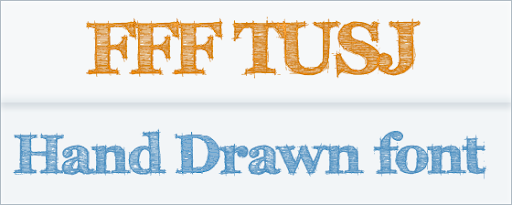
Everyone loves sketchy fonts. Everyone loves Helvetica. Combined = :D


It's just fun. I'm imagining something like Innocent Smoothies or Fairtrade..I dunno..All I know is that it's a great font.

It's almost impossible to have a list of fonts without including a VTKS font, and this is my favourite. I can almost imagine it being used in an ad for perfume..Almost.


It was a toss-up between this and its bitter rival WC Roughtrad, but I decided on Tusj, partly because its better, and partly because I haven't done enough serif fonts.


A lot of grunge fonts can be difficult to read and ineffective, but Misproject is grungy, striking, and just generally great.


Handwriting fonts are usually hard to read or repetitive and dull. This is one of the few that I actually like.


You may never find a use for it, but it looks great and its a good one to have in your collection in case of emergency.

___________________________________


So, what are your favourite fonts? And if any company owners are reading this whose logos use the font Papyrus, please download ANY font and change it right now. It's not even a good font, and yet everyone uses it.